

April 11th, 2023
7 minutes read
Do you want to receive our newsletters? Sign up
The Peugeot Lion is one of the most iconic symbols of the French automotive industry. It represents the pride, strength and quality of the cars produced by Peugeot. But where does this emblem come from and how has it evolved over time?
At the end of the 1940s, Emile Peugeot wanted to identify the Peugeot brand by creating a logotype. At that time, many people could neither read nor write, so a logotype made it possible to recognise a brand at a glance. He asked a goldsmith from Montbéliard, Justin Blazer, to create an emblem. The goldsmith was inspired by the qualities of Peugeot's flagship product, the saw: speed, flexibility and bite. The lion symbolised everything about Peugeot, and the animal was placed on an arrow to highlight the saw's cutting speed.


The logo of the lion on the arrow was adopted in 1850 and engraved on the saws and registered at the Conservatoire des Arts et Métiers (an institute specialising in industrial and social sciences, used in the past as a depository for inventions). In 1858, it became the official logo of the Peugeot brand, symbolising its success.
The logo of the lion on the arrow was adopted in 1850 and engraved on the saws and registered at the Conservatoire des Arts et Métiers (an institute specialising in industrial and social sciences, used in the past as a depository for inventions). In 1858, it became the official logo of the Peugeot brand, symbolising its success.

The Peugeot Lion appeared on the cars created by the sons of the Peugeot brothers, around 1907. These 'Lion Peugeot' cars proudly displayed the emblem on their radiator grille.
The Peugeot Lion appeared on the cars created by the sons of the Peugeot brothers, around 1907. These 'Lion Peugeot' cars proudly displayed the emblem on their radiator grille.
The evolution of the Peugeot Lion over the years
In the 1920s, the Peugeot Lion was affixed to the top of the radiator grille: two designers honoured the Peugeot brand by creating radiator caps topped with a Lion figurine.

Cap designed by Marx: here, the Lion poses proudly, paw forward. It represents the elegance of the Brand.
Cap designed by Marx: here, the Lion poses proudly, paw forward. It represents the elegance of the Brand.

Cap drawn by Baudichon: it shows the Lion in movement, running fast, with his mane in the wind. His nickname was "en 4e (vitesse)". It's reminder of the atmosphere of the time, 'the crazy years', swirling, fast and modern.
Cap drawn by Baudichon: it shows the Lion in movement, running fast, with his mane in the wind. His nickname was "en 4e (vitesse)". It's reminder of the atmosphere of the time, 'the crazy years', swirling, fast and modern.
From the 01 generation of vehicles (201, 301, 401 and 601) onwards, the Lion's head is integrated into the grille. The four-pronged Lion adds a touch of elegance to the front of Peugeot vehicles.

The emblem on 302 and 402 (1935-1942)


The emblem on the 202 (1938-1949)
Did you know?
There is a debate about the gender of the symbolic animal: is it a lion or a lioness? Indeed, some people argue that it is the hunter lioness who is fast and has bite, unlike the male lion who stays with the group, over which he rules with authority and pride.
Whatever the case, male or female, the feline remains the symbol of the exceptional elegance of Peugeot vehicles.


From the 203 onwards, the style of the cars evolved with the removal of the large vertical grille. The Lion then took on a new look: it moved from the grille to the bonnet.

In October 1957, external protrusions were banned on vehicles, so Peugeot needed to rethink. The heraldic Lion was inlaid in a coat of arms, similar to the emblem of Franche-Comté, the birthplace of the Peugeot brand. The standing Lion (which had begun to appear in 1948) now replaced the Lion walking on the arrow.
In October 1957, external protrusions were banned on vehicles, so Peugeot needed to rethink. The heraldic Lion was inlaid in a coat of arms, similar to the emblem of Franche-Comté, the birthplace of the Peugeot brand. The standing Lion (which had begun to appear in 1948) now replaced the Lion walking on the arrow.
It is important to note that the logo on a brochure may be different from the emblem on a car. In the same way, for the same year, the Lion logo could be different depending on the model.
Thus, in the 1960s, we created a version of the Lion showing inly its head, enlarged and placed in a shield, with the name Peugeot written at the top.
Thus, in the 1960s, we created a version of the Lion showing inly its head, enlarged and placed in a shield, with the name Peugeot written at the top.
Five years later, the Lion's head changed again: the rounded contours gave way to simpler, angular lines. The crest was removed, but the Peugeot inscription was retained.
Five years later, the Lion's head changed again: the rounded contours gave way to simpler, angular lines. The crest was removed, but the Peugeot inscription was retained.

At the dawn of the 1970s, the grille logo changed. It left its coat of arms and changed from gold to a more sober silver colour.
At the dawn of the 1970s, the grille logo changed. It left its coat of arms and changed from gold to a more sober silver colour.

Peugeot 505 grille
At the beginning of the 1980s, with the launch of the fifth generation, including the 305 and 505, Peugeot once again redeveloped the Lion. The shape remained the same but became more refined, with a simple silver outline on a black background.
At the beginning of the 1980s, with the launch of the fifth generation, including the 305 and 505, Peugeot once again redeveloped the Lion. The shape remained the same but became more refined, with a simple silver outline on a black background.
In the mid-1990s, the Lion grille evolved again: it became solid silver with a vertical rib in the middle. This stayed the same, with some modifications, until 2010.
In the mid-1990s, the Lion grille evolved again: it became solid silver with a vertical rib in the middle. This stayed the same, with some modifications, until 2010.
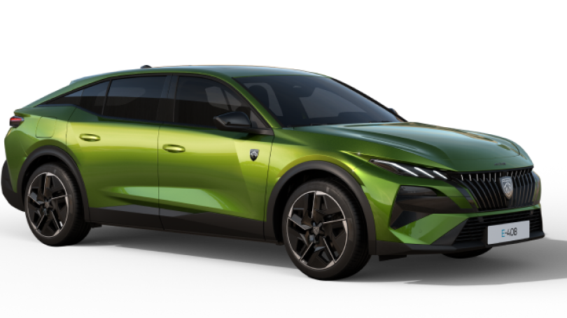
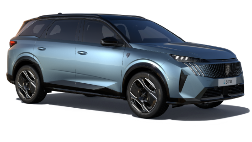
Finally, in 2021, the current Peugeot logo was adopted. Modernised, it reflects the Marque's involvement in the energy transition process, with a simplified and streamlined version of the emblem (reminiscent of the 1960s version), in line with the challenges of the 21st century.
Finally, in 2021, the current Peugeot logo was adopted. Modernised, it reflects the Marque's involvement in the energy transition process, with a simplified and streamlined version of the emblem (reminiscent of the 1960s version), in line with the challenges of the 21st century.
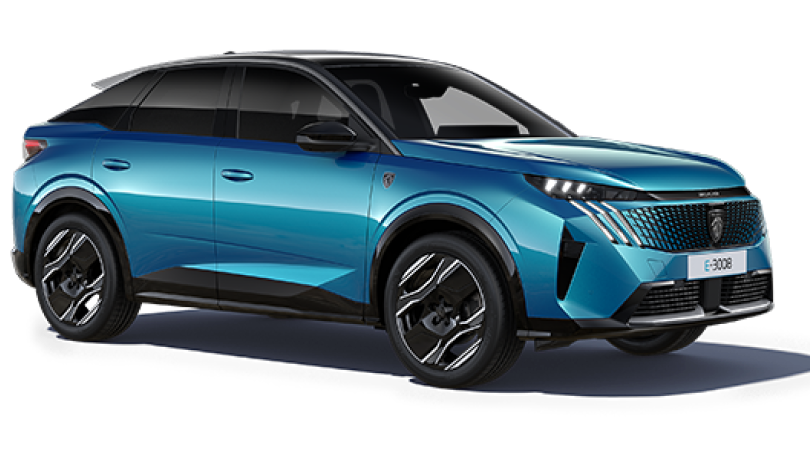
Today, the Peugeot Lion emblem is recognised throughout the world and is associated with Peugeot's values: allure, excellence and emotion. It symbolises the company's history and tradition, as well as its commitment to ever-greater quality and innovation.
Today, the Peugeot Lion emblem is recognised throughout the world and is associated with Peugeot's values: allure, excellence and emotion. It symbolises the company's history and tradition, as well as its commitment to ever-greater quality and innovation.
Discover the evolution of the Peugeot identity in video
DISCOVER ALL OUR ARTICLES
